
colour palettes
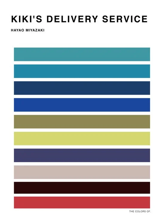
As we all know by now, I’m a bit of a Studio Ghibli fan. And I recently came across a guy who watched all the movies, studied the animation, and picked out the most prominent colours in each movie. His name is Hyo Taek Kim. Then, after deciding on the colour palettes, he created some simple yet gorgeous posters. I’m very tempted to buy one or two, but I haven’t watched all of the movies yet and I want to do that first. I’ll attach a link to where you can buy his stuff if you’re interested!


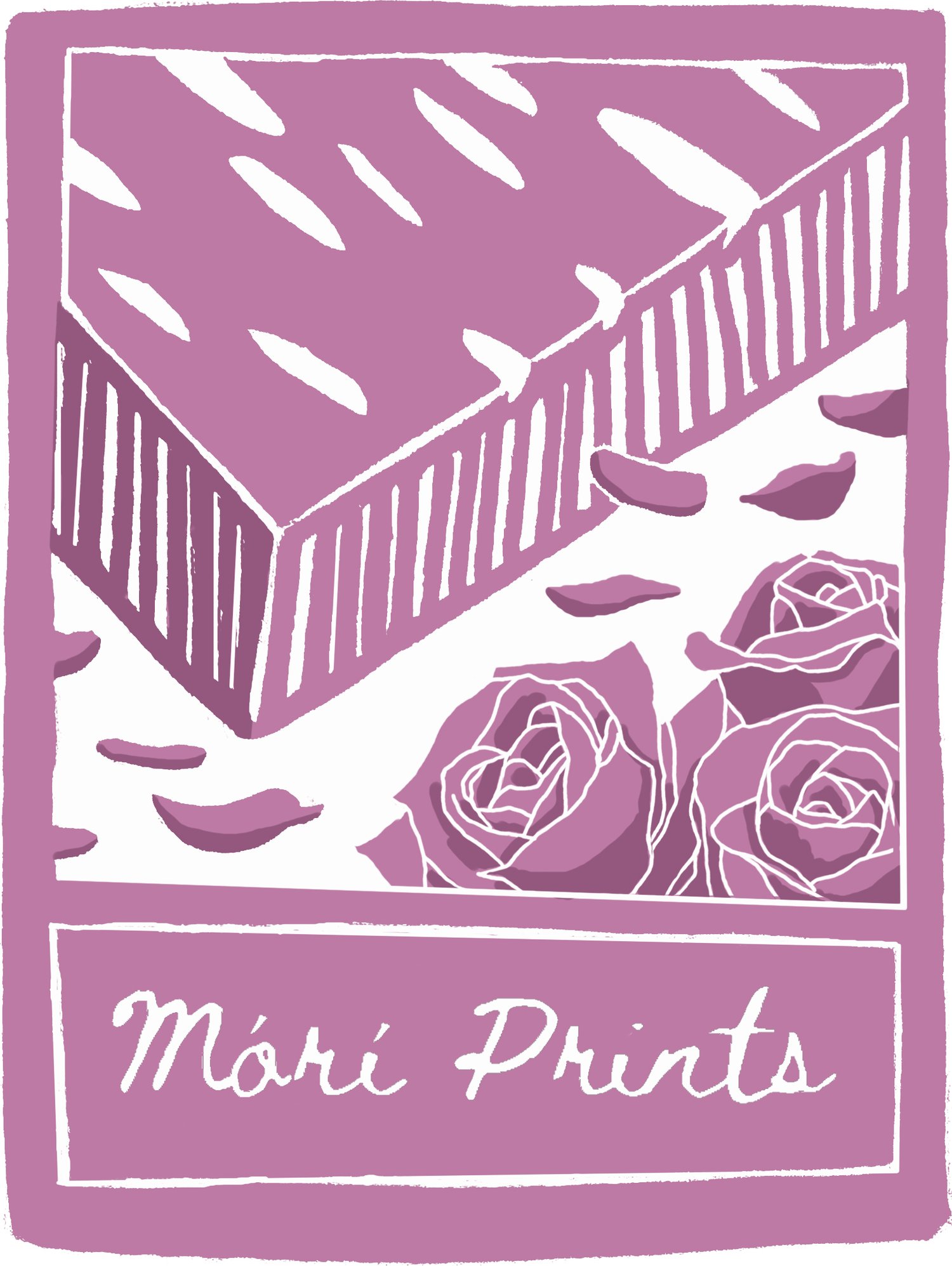
Taking inspiration from that, I decided to go back and look at my previous drawings. What colours have I been using the most? Would I use these again? Could I make my own personal colour palette?
Obviously, mine are not as polished as Kim’s professional posters, (he carefully chose 10 distinct colours whereas I picked out all of my colours) but you get the general idea of what I’m going for.


I actually find the results quite interesting. People often use colour palettes in fashion as well, in regards to seasonal tones, where a certain palette compliments a person’s features more than another. I’m a ‘cool summer’ (which I took a lot of online tests to figure out and even now I feel like I might not be 100% correct). Looking at the palettes my drawings have created, my brain sees them in the fashion light rather than the traditional artist way.
Down the line, it could be fun to draw characters based on these flower arrangements and to dress them in these colours… I think I’d have a lot of fun with that, hmm…