
letterpress workshop
For anyone who wants to get back into art, or just to try something new without committing hours to it, I highly recommend workshops.
The one I attended recently was a taster workshop held by Edinburgh Printmakers and overseen by Fiona Maher. Letterpress has always been something I’ve been interested in but never actually got around to trying out. The college where I studied did not have one, although the printmakers in the city did —but again, I never got my act together and went for it. So, when I saw this workshop pop up, I jumped at the opportunity.
It was only two and a half hours, enough for a taste but nothing in-depth.
And I can confidently say it has hooked me!
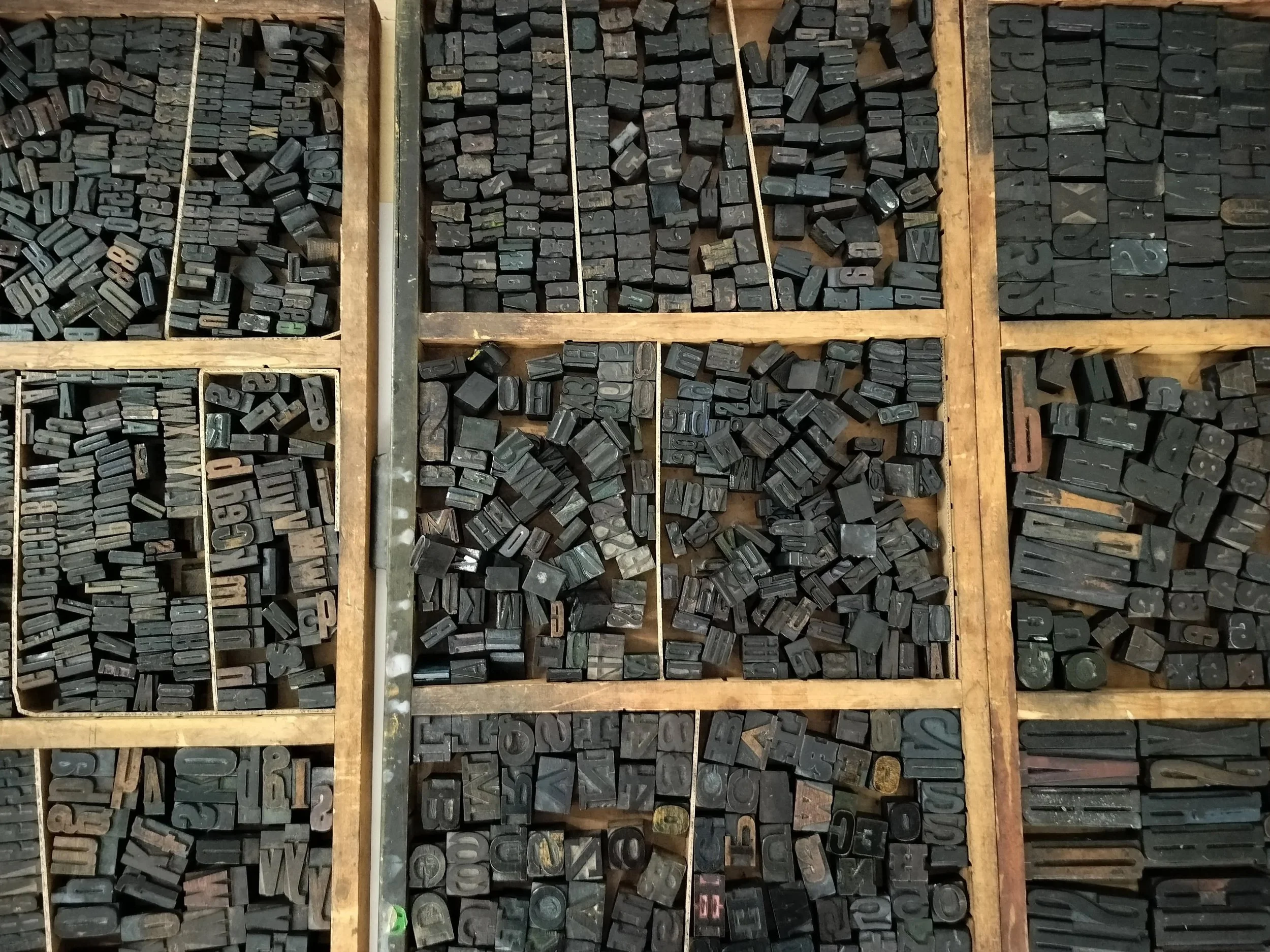
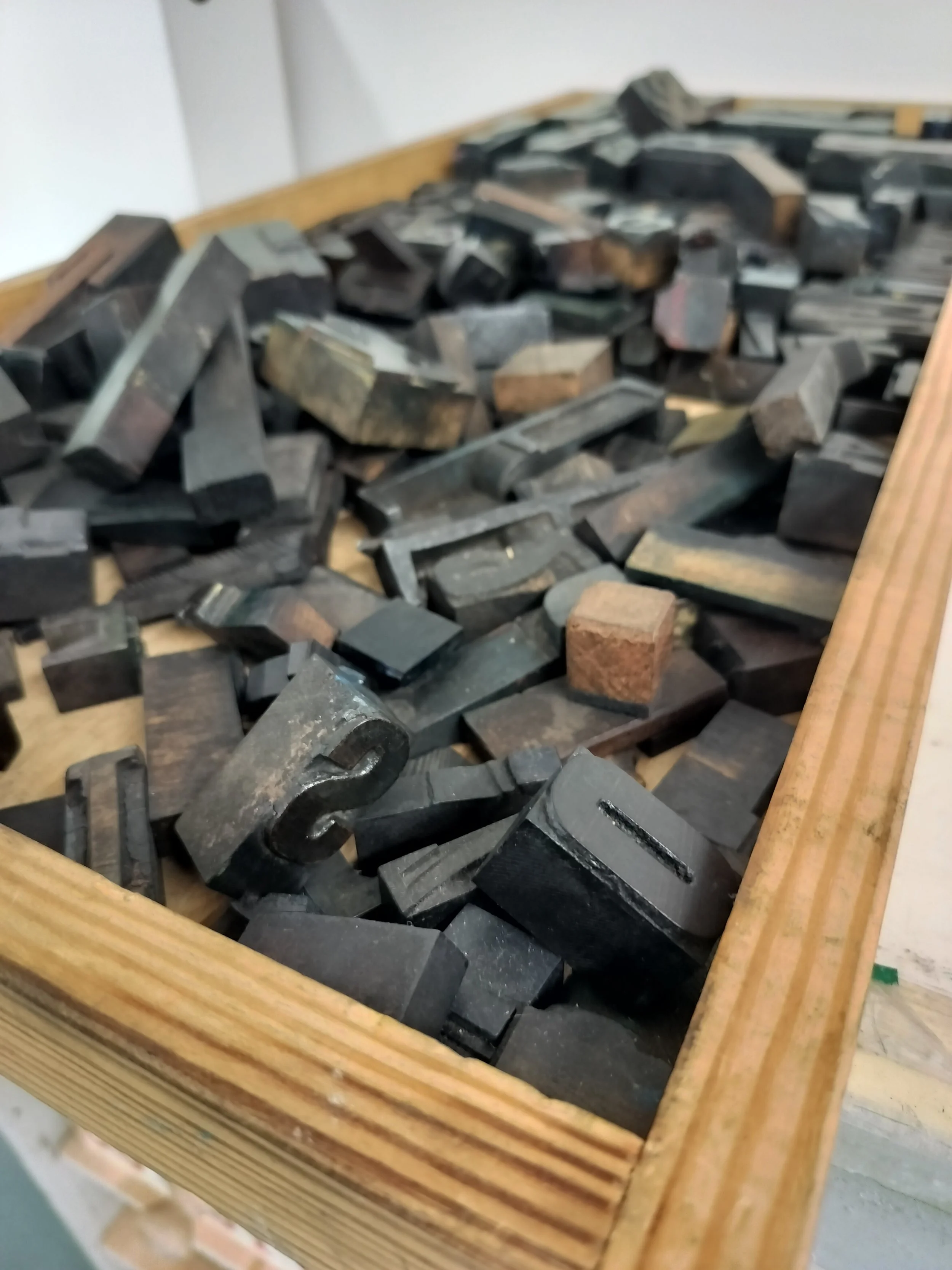
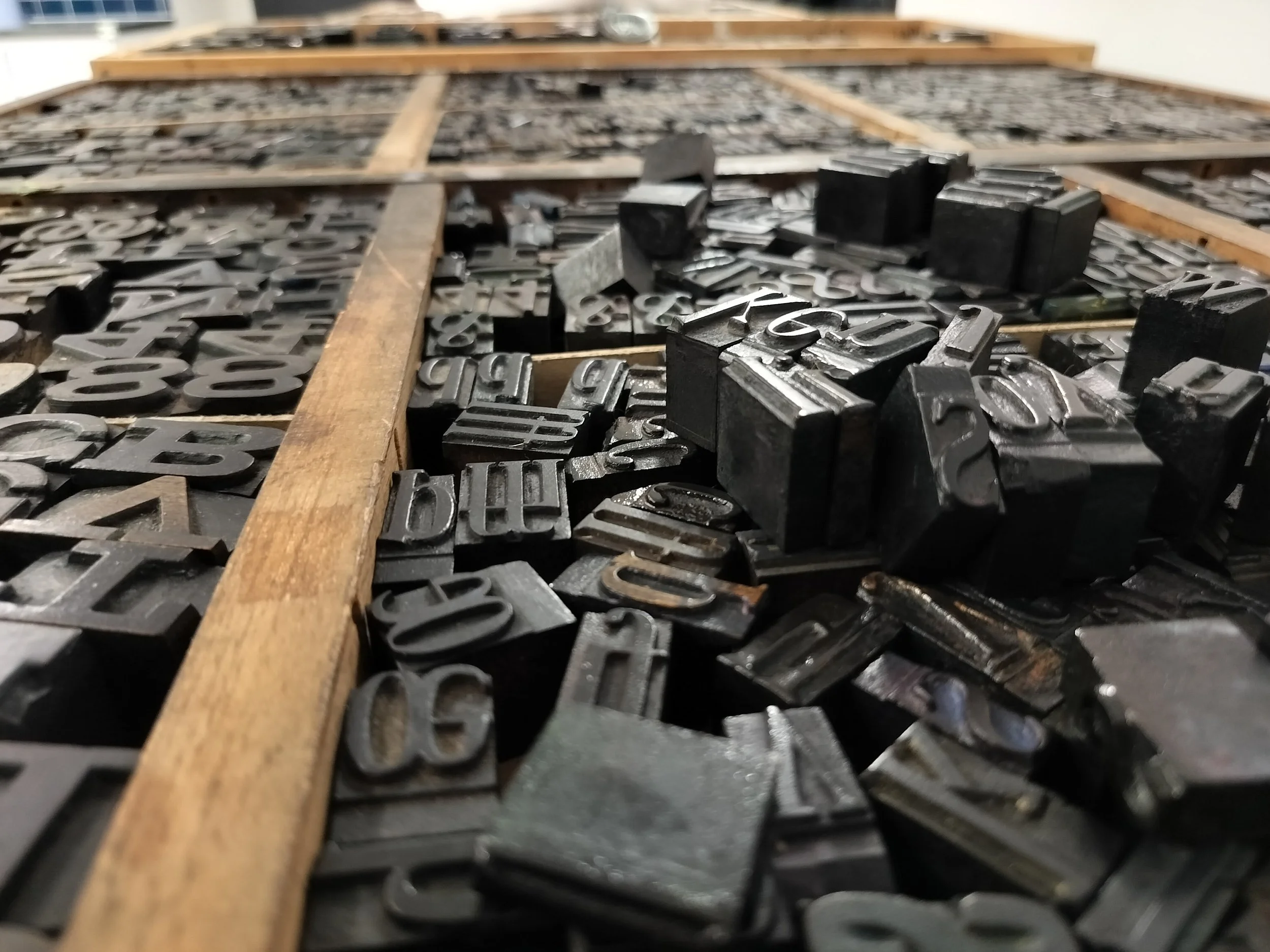
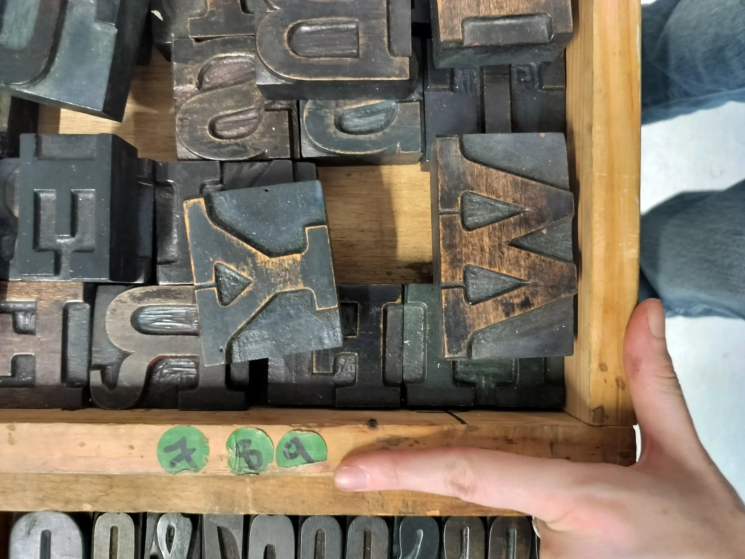
So many fonts!
If I was more organised I would have prepared sentences or a phrase to work with but alas, I did not. When we were told to grab our letter, I stood there for a few minutes, mind blank. I had all the tools, the ink, the letters… now what did I want to say?
The first thing that popped into my head was a phrase a friend of my mom’s would always say (she was also my secondary school principal for a while). She is a very organised woman and the phrase sums it up perfectly:
“What’s wrong with now?”
As a serial-procrastinator this phrase has helped push me into action more times than I can count. So I believe it deserved to be immortalised in ink.
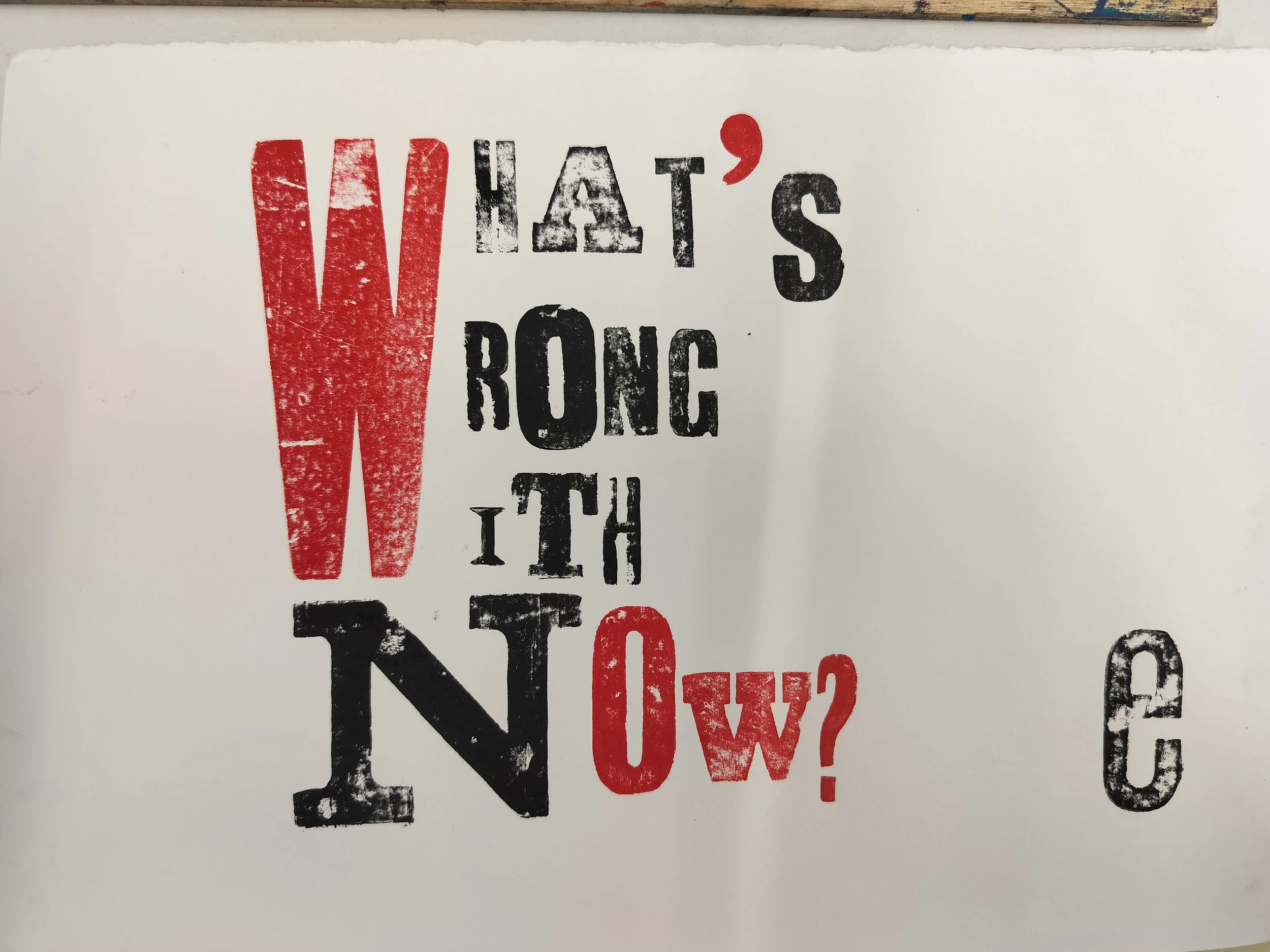
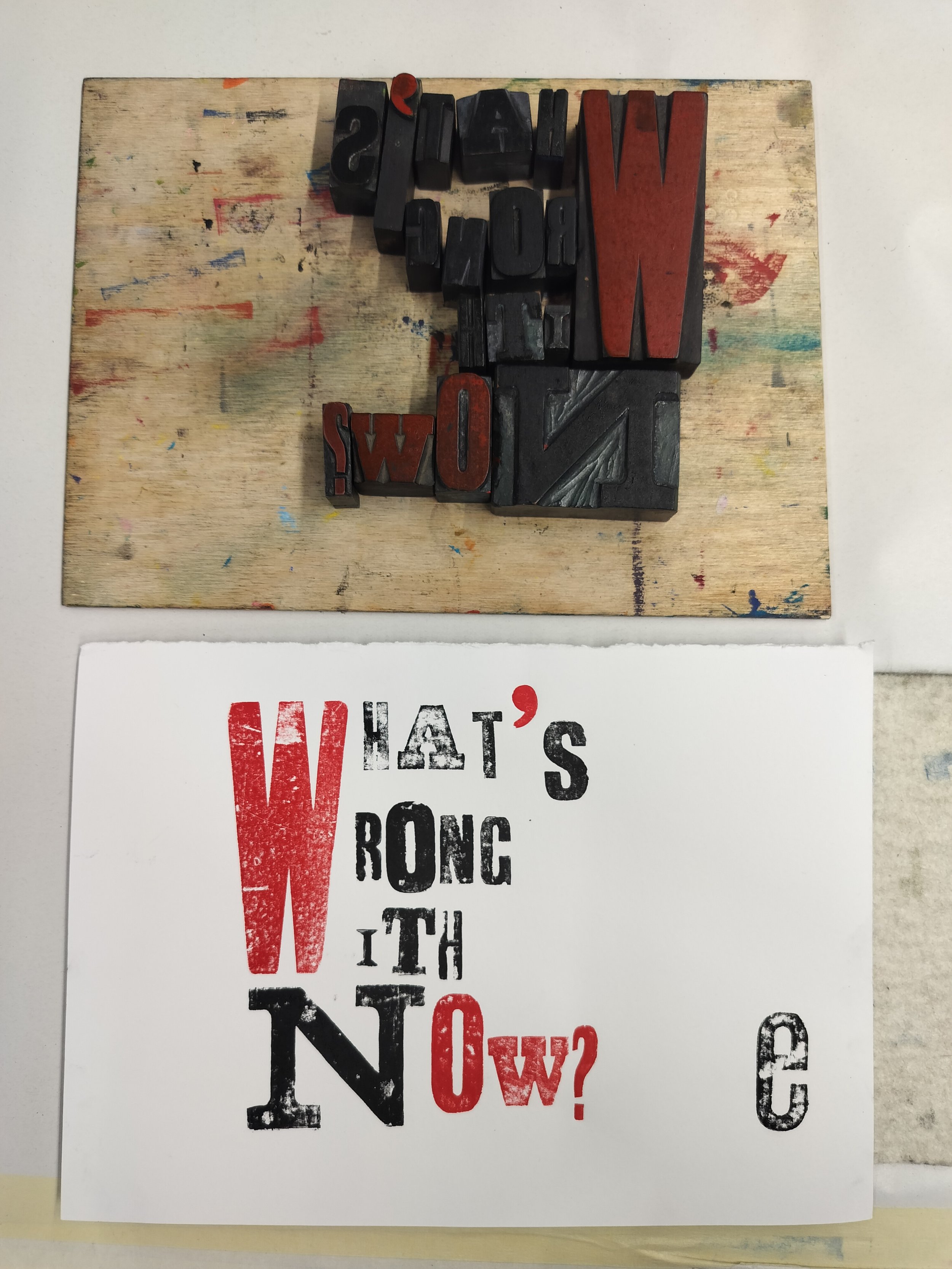
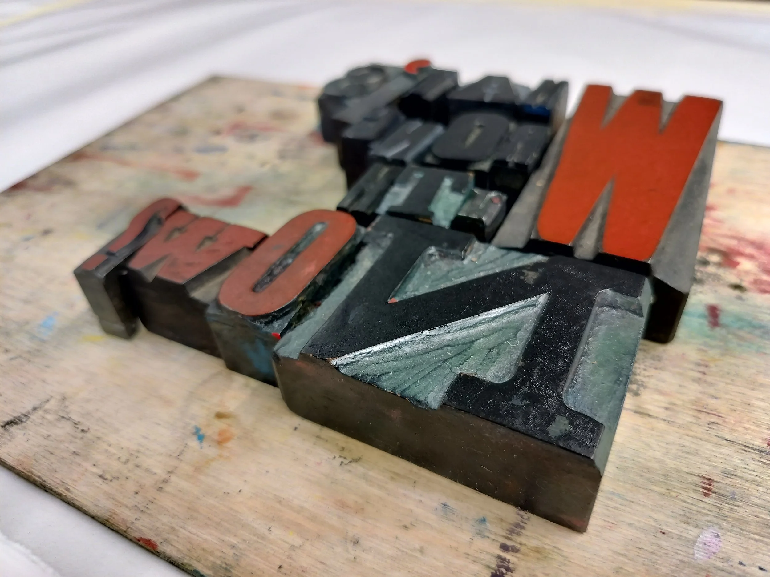
Going purely by instinct (again, no plan to see here!) I chose black and red for my colours. The start of a joke popped into my head:
Question: What’s black and white and red all over?
Answer: A newspaper!
(Or a nun falling down the stairs if you’re more inclined towards dark humour, lol)
I was quite pleased with how it turned out, although some of the letters came out fainter than I had wanted, but I suppose that just adds to the charm. I did reprint one of the letter by using the residual ink left on it and pressing down with more pressure by hand, without the printing press. A good eye and steady hands.
Tip: When rolling the ink onto your letter blocks, instead of holding them aloft, put them on a table as this will apply more pressure and ink coverage!
I’m definitely going to frame it and stick it on my wall!
The next thing I printed was the name of my art practice: Morí Prints. (forgot to add the first fada, oops)
One of the other attendees had rolled out a lovely orange/gold and green combo so I used that.
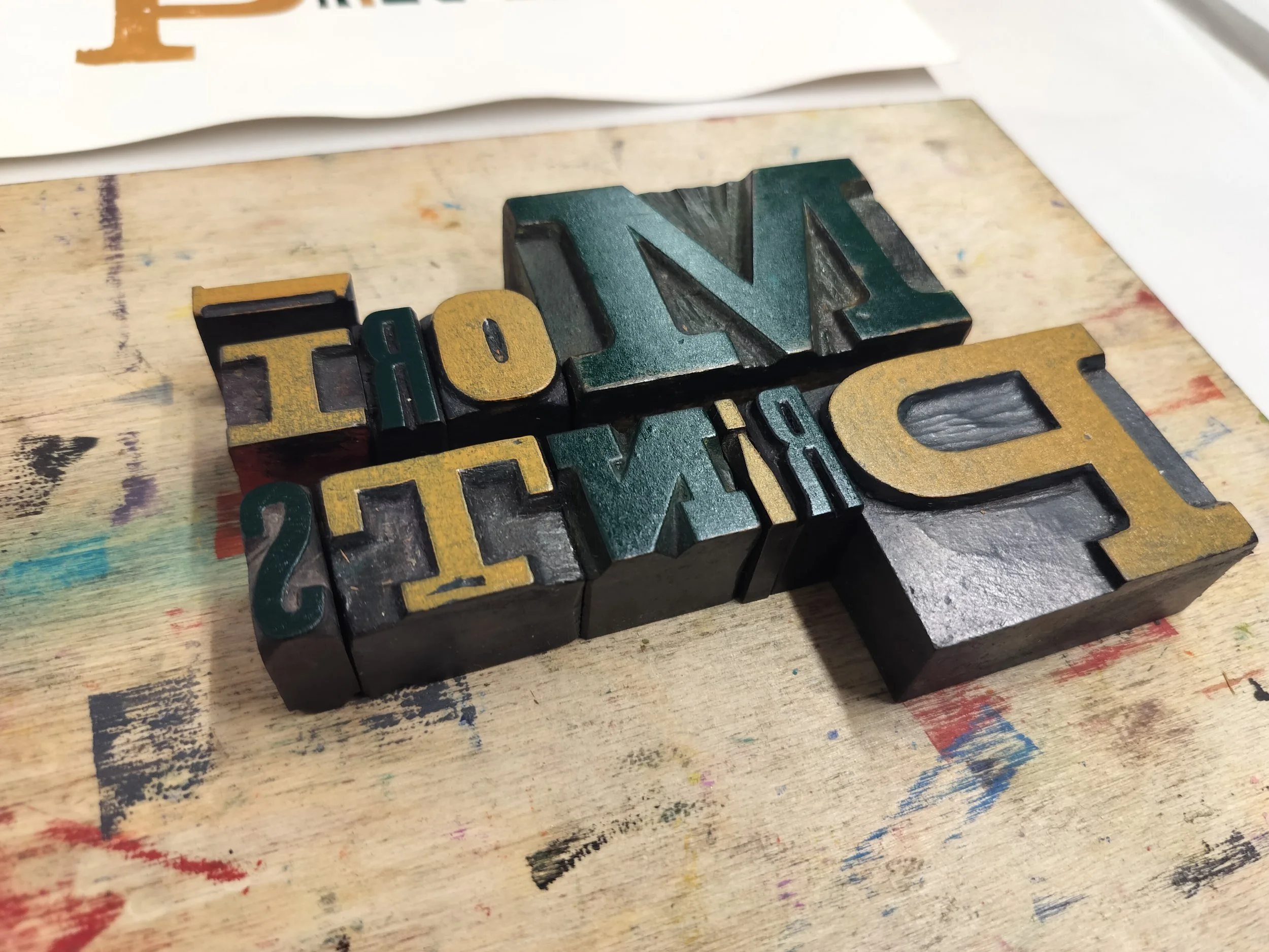
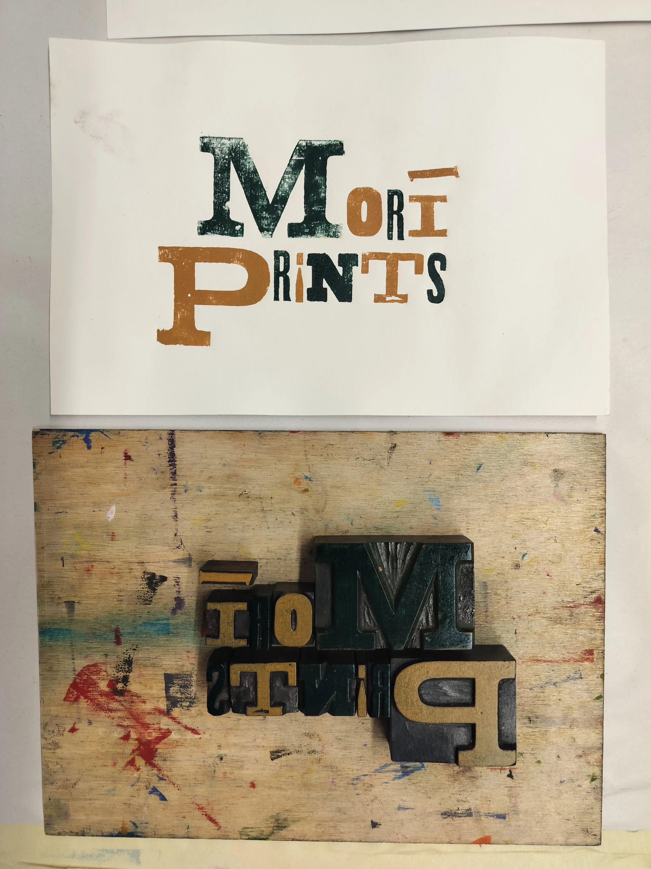
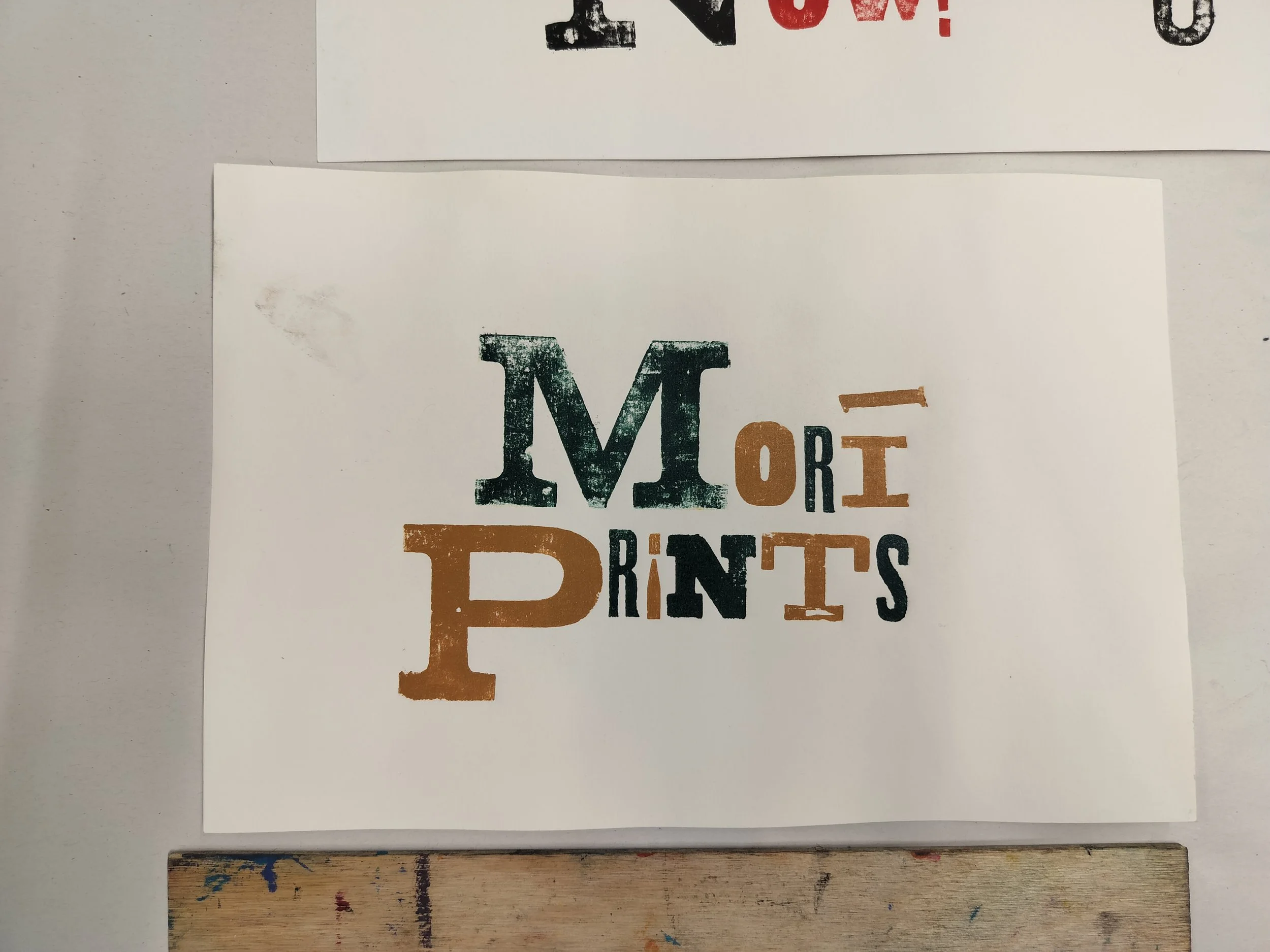
Honestly, I’d be happy with framing the inked up letters all by themselves! They’re so nice to look at.
I took it a step further and printed it onto some of the test prints I had of my latest carpentry print (I had enough foresight to bring them along!)
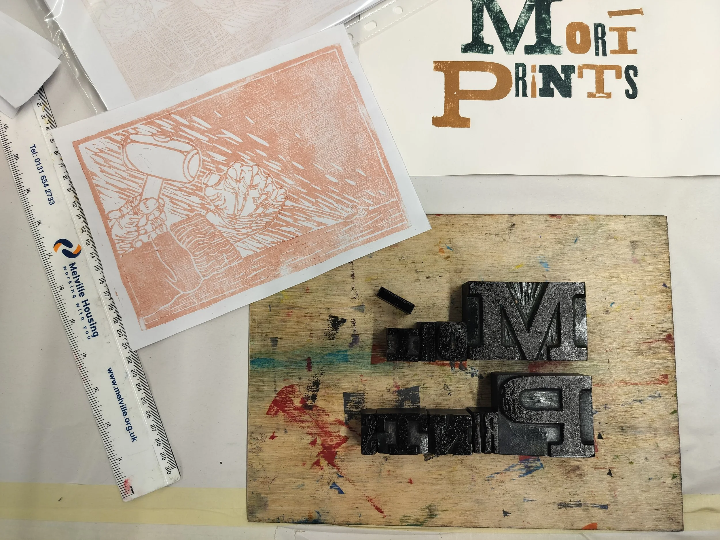
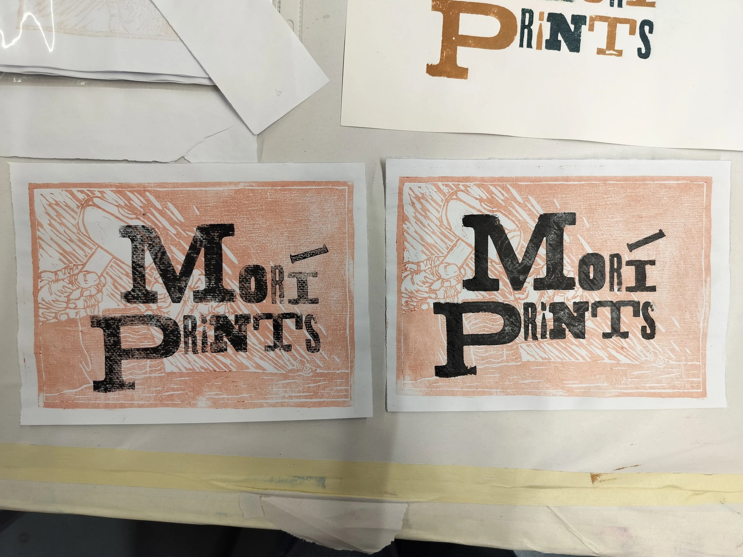

I think they turned out pretty alright.
And then it was time to clean up and go home.
It really was just a taster. But I was still hungry! I wanted to do more and try out other fonts and phrases and compositions!
Luckily, members at the printmakers do have access to the letterpress so if I join I can use them to my heart’s content! More to come in the future.
Wish me luck!