
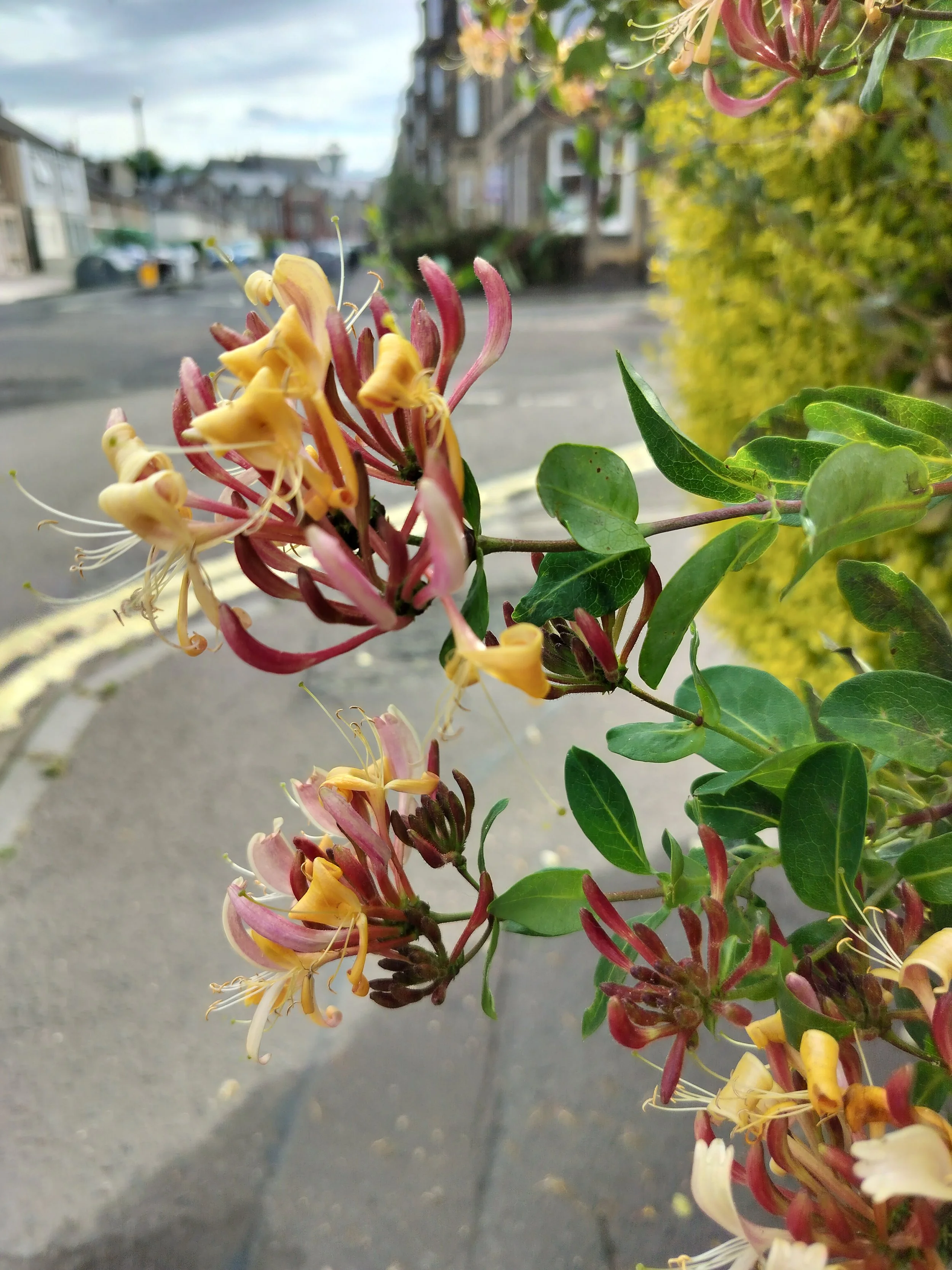
honeysuckle
Well, it’s been a minute since my last post, hasn’t it?
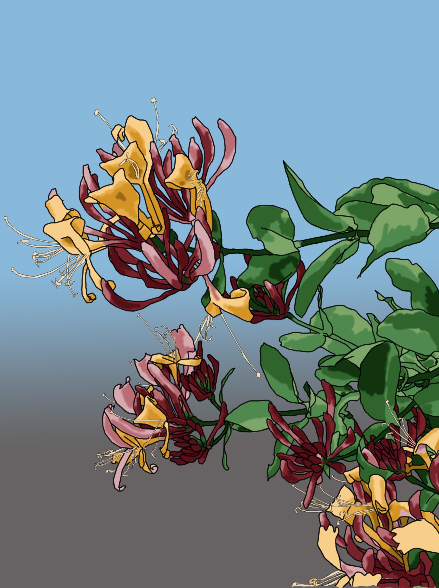
Here is the newest and latest digital drawing. And it’s not a vase composition for once! I walk by this honeysuckle bush all the time and I figured I might as well try drawing it. I love the colours for this one. Usually they are paler and don’t have those gorgeous pinks but this one does!
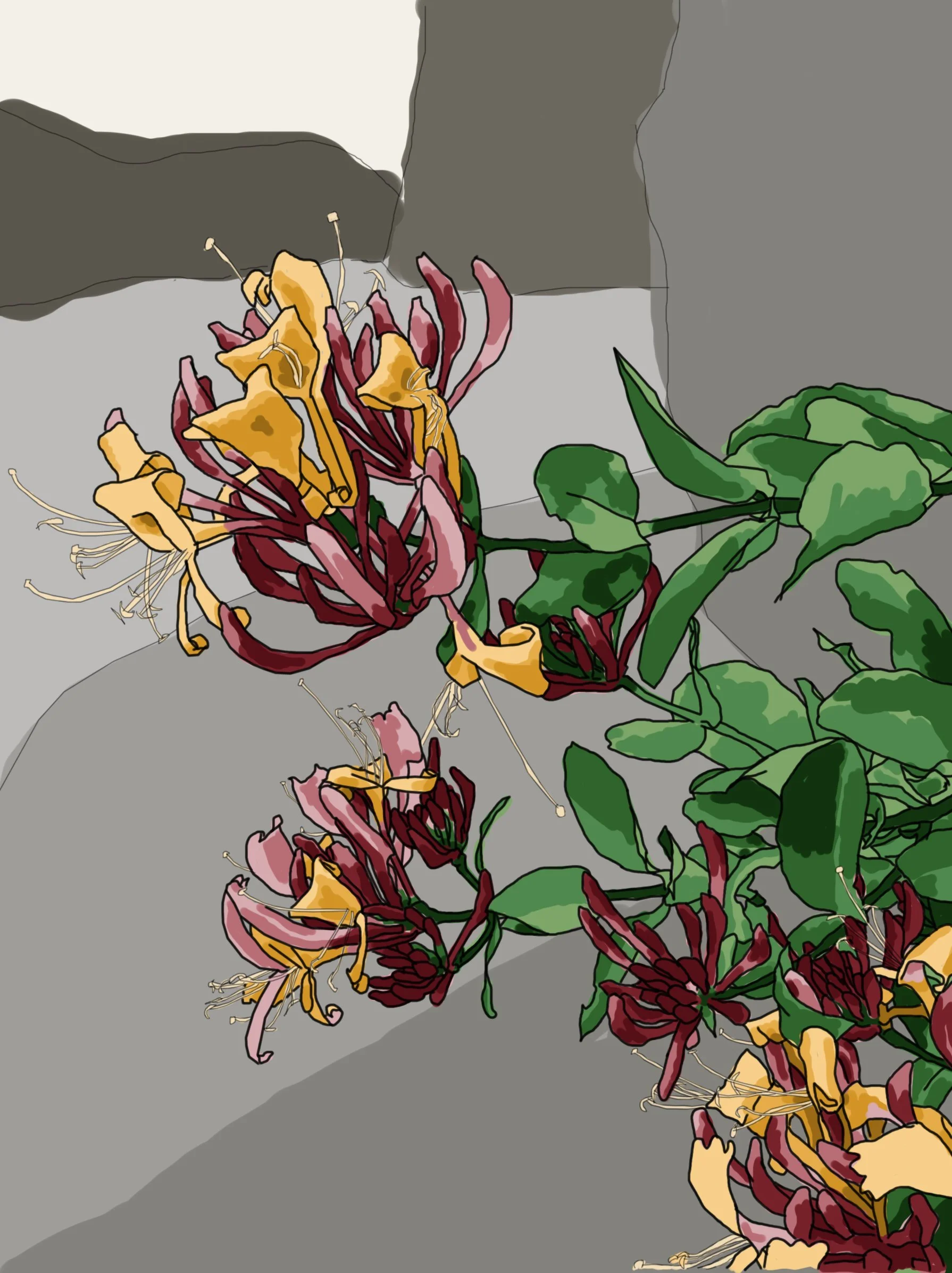

I’m not settled on the background colour. I think I do like the idea of a gradient, much like many Japanese prints, so I think I’ll play around with it a bit more. Perhaps something more toned down to make those pinks pop.

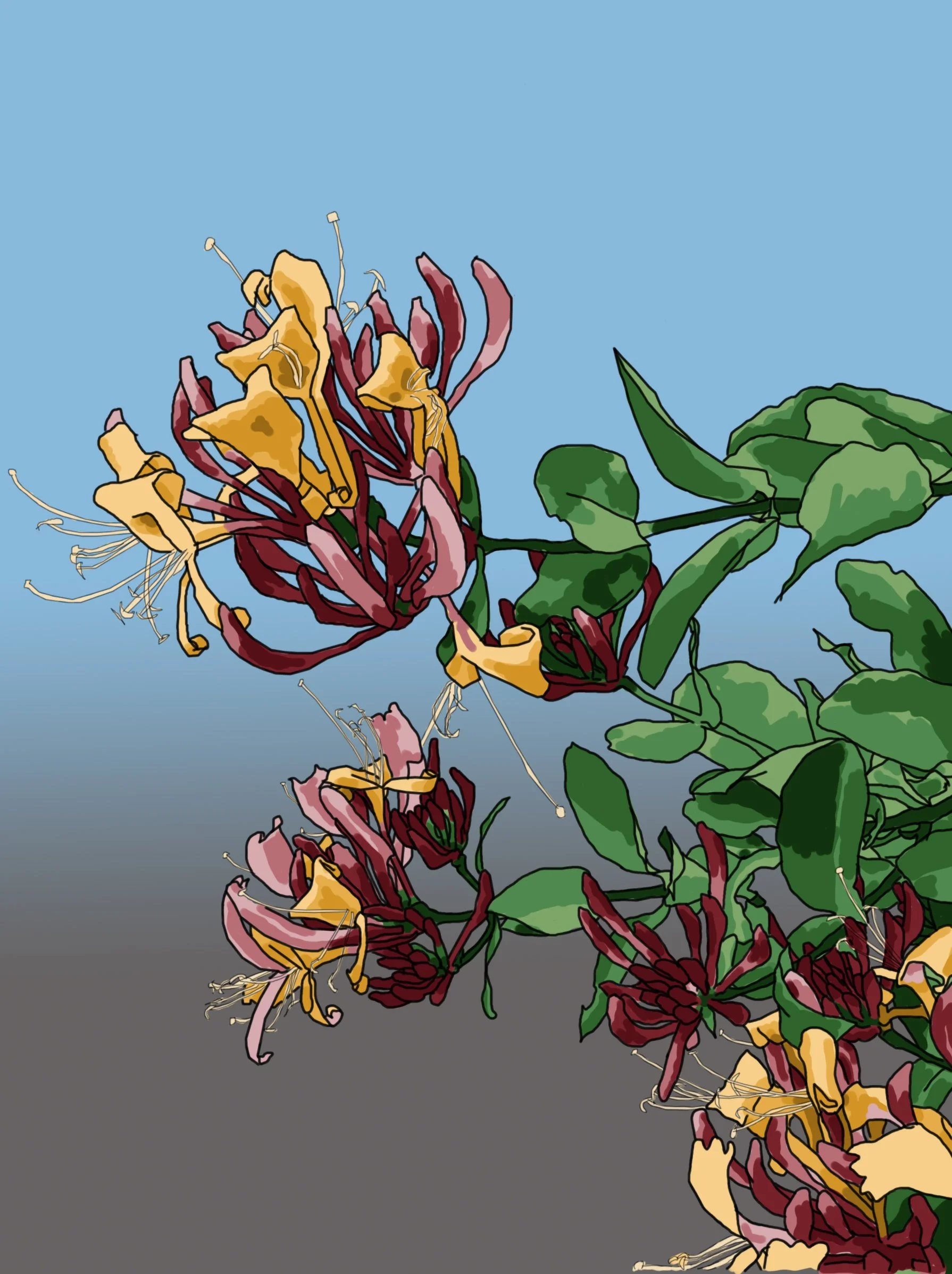
The three images above just show how I tidied everything up. (Left to Right) The first one has all the rough colouring, the second one has it cleaned up with no colour going over the lines, and the third has the colours blending together a bit better.
Subtle, I know, but it all makes a difference.