
mokuhanga studies #2
Several months later, I am clambering back onto the wagon that is my mokuhanga studies. This time, I actually have a plan. I know, crazy stuff. My plan/goal is to complete a (singular) print in the next 3 or 4 months before the end of this year. Sounds doable, right?
Month one: research and sketching up ideas until I have a concrete drawing.
Month two: transfer that drawing onto a woodblock and get carving.
Month three: inking up that carved woodblock and printing it until I’m happy with the final result.
I am currently on month one and here’s what I have to show so far:
I’m trying to document every bit of the process as I go because I know I will not remember this a year from now unless it’s written down somewhere. And hey, this might help someone else down the line -who knows?
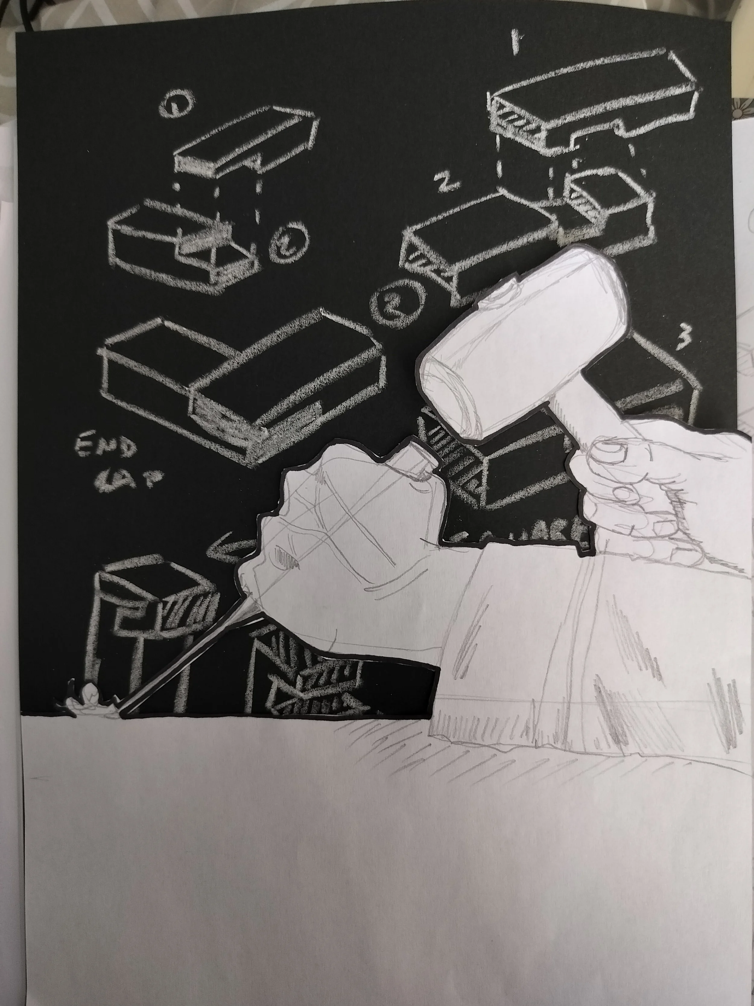
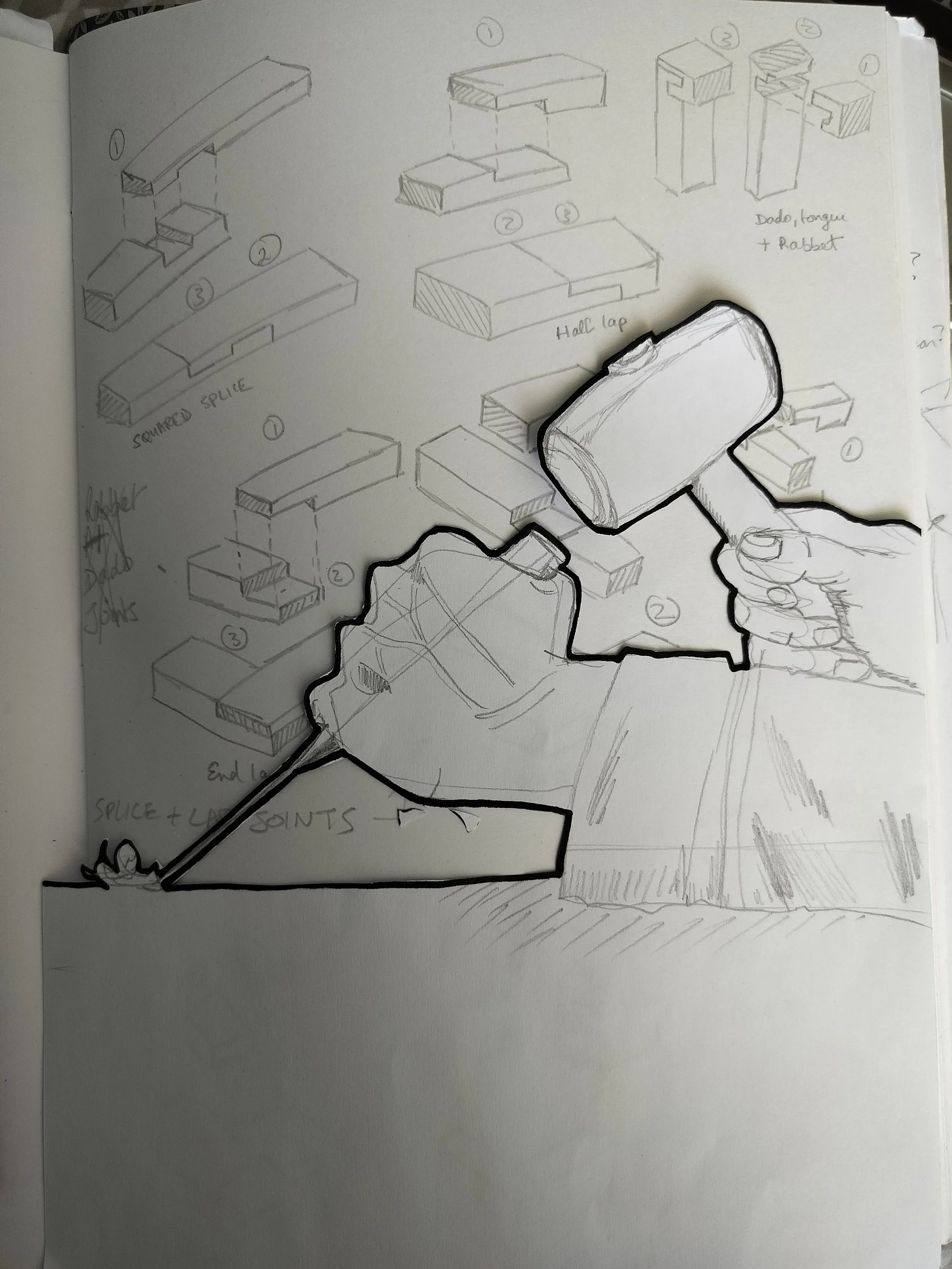
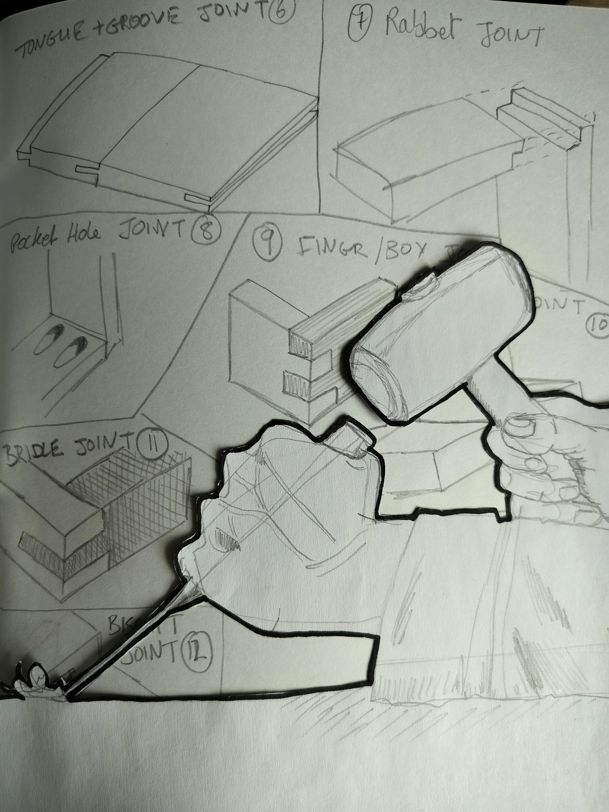
The initial drawings are going well, and I quite like these little sketches that I’ve done. It really helped when I cut out the main drawing so I could lay it over the white paper sketch and then with the black paper sketch to get a proper comparison!
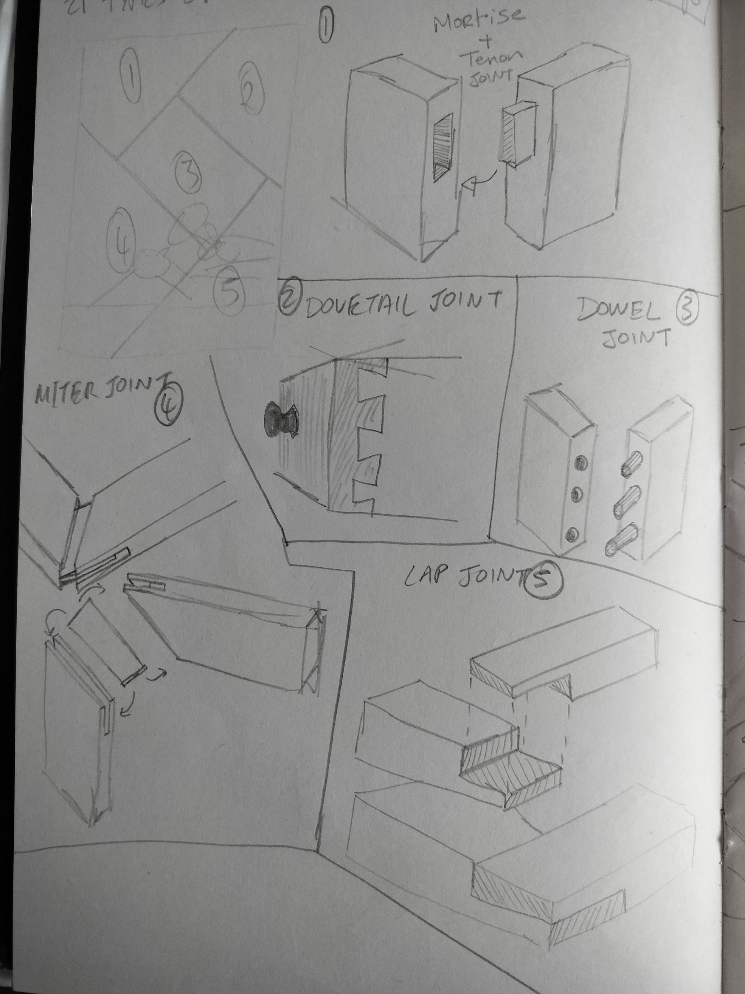
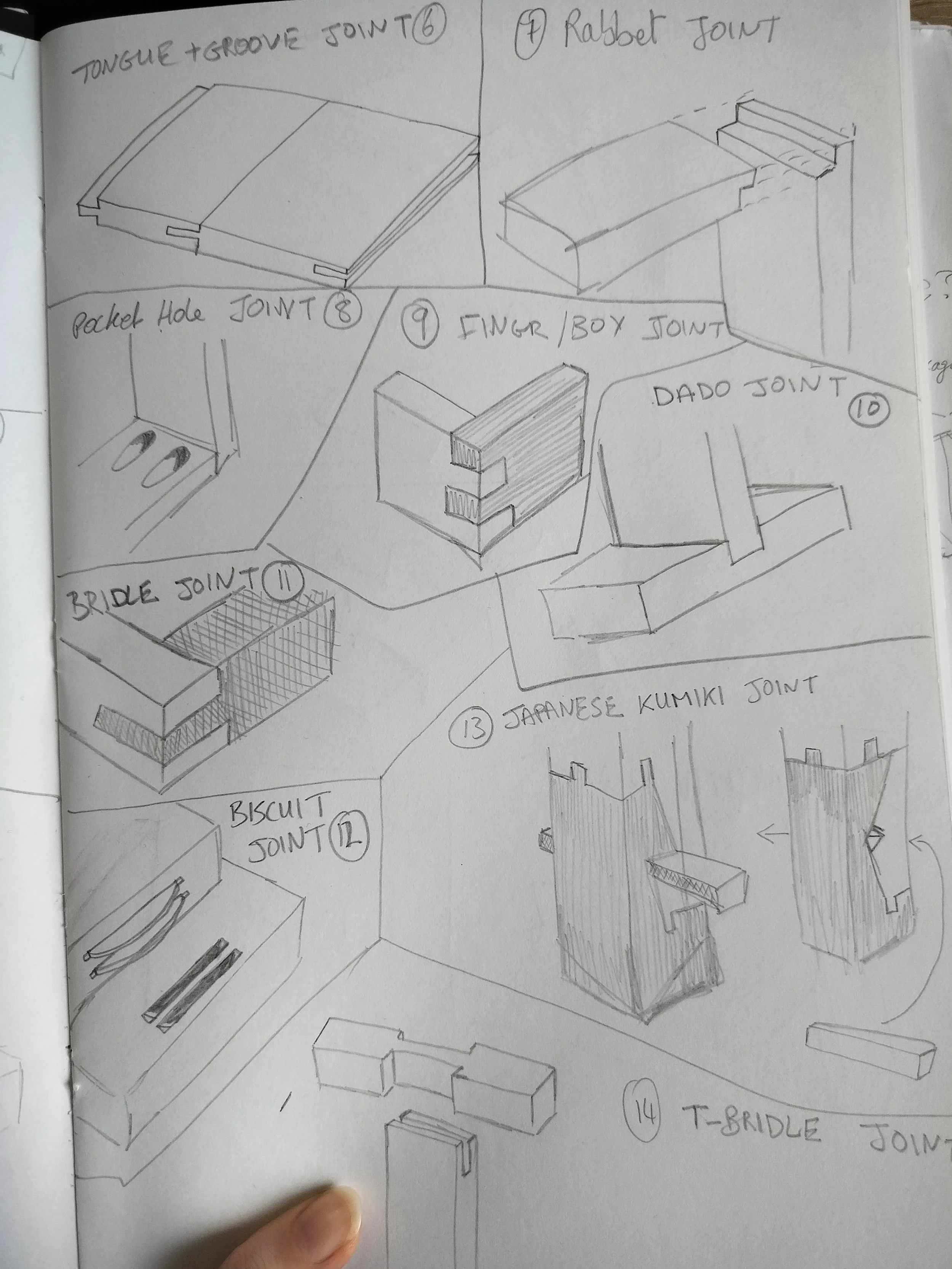
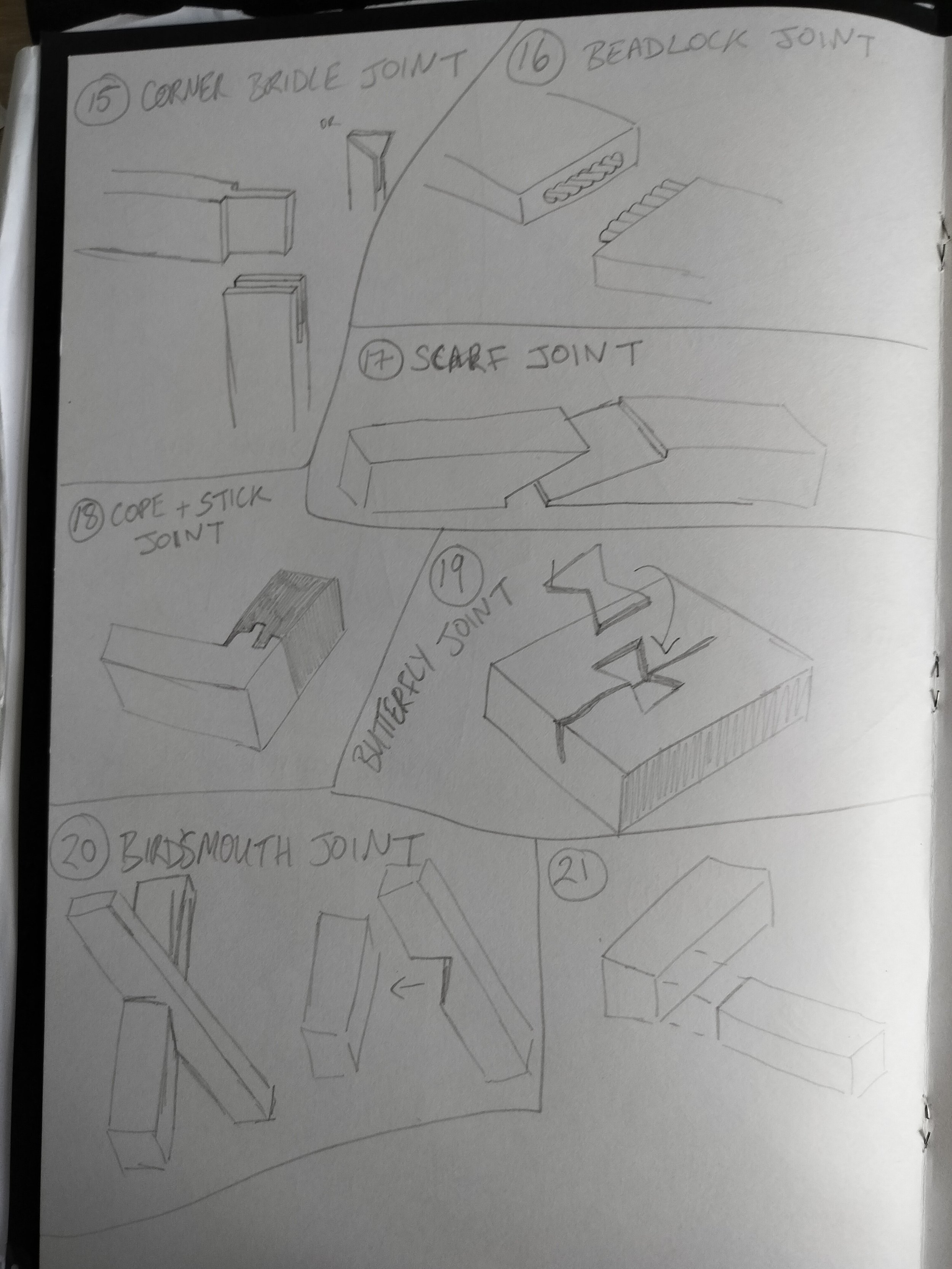
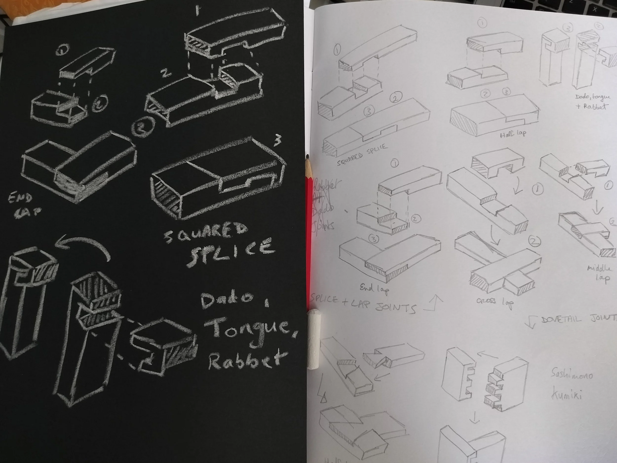
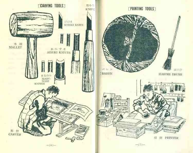
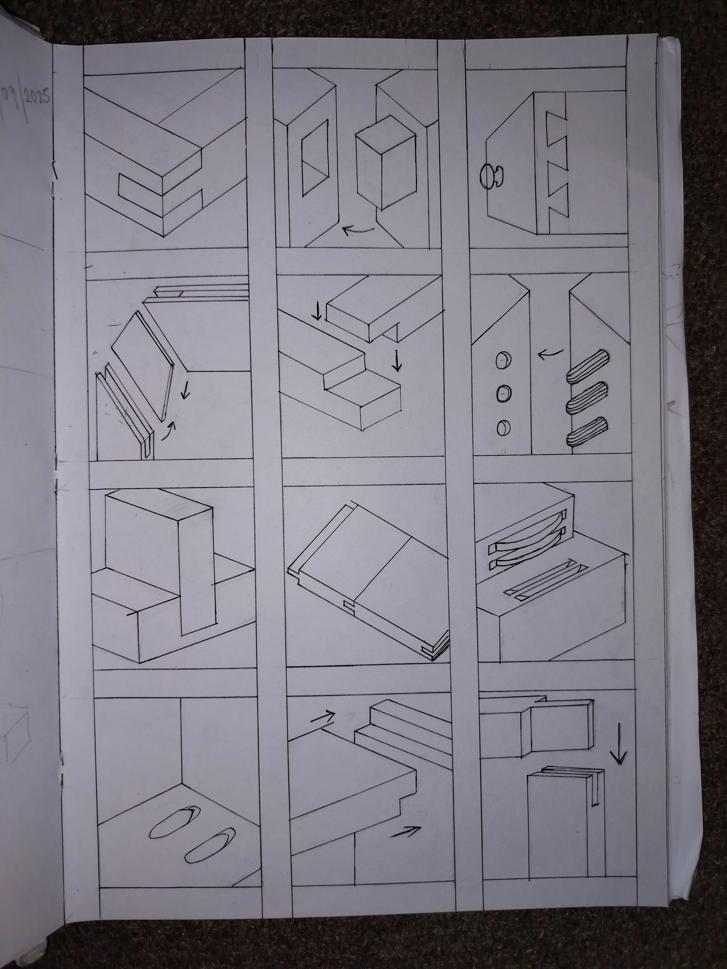
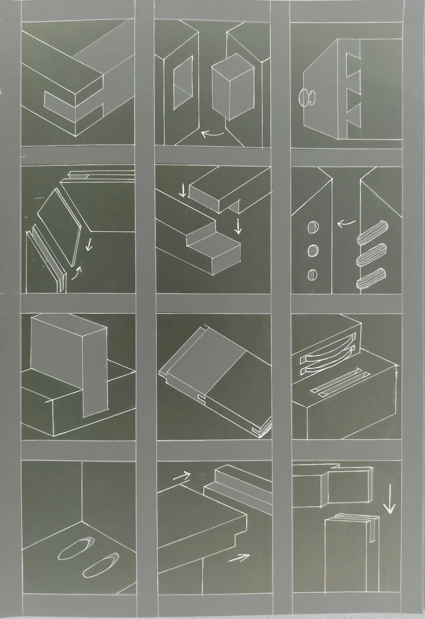
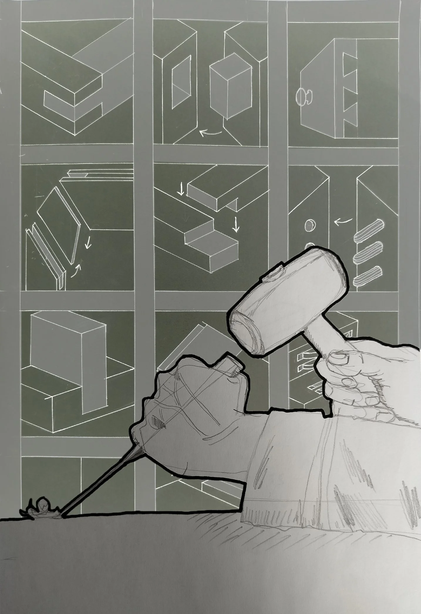
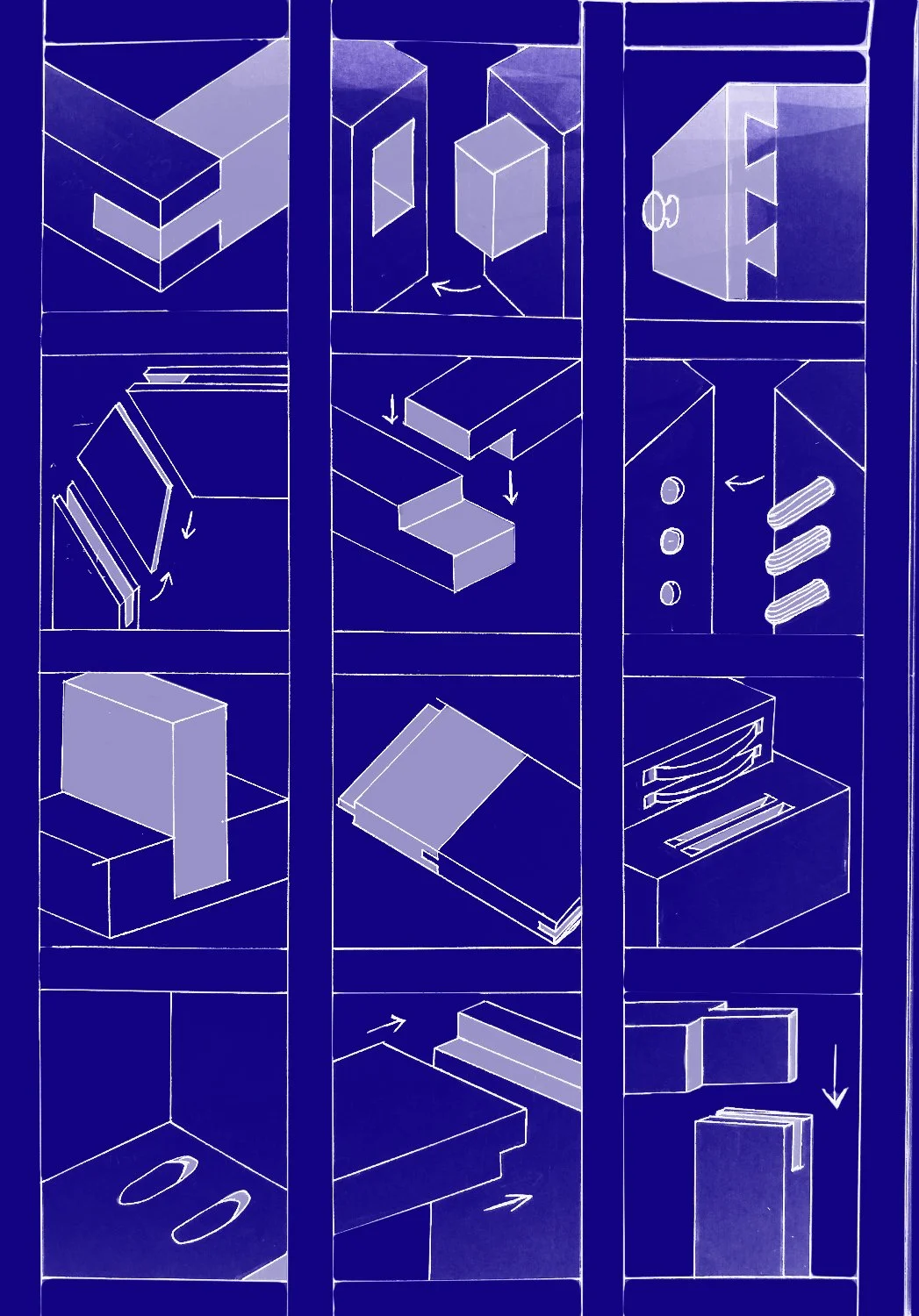
The three pages above are 21 examples of the strongest joints you can use in carpentry (of course, it all depends on what you’re working on) according to an article a quick google search provided me with. (There’s a link just below if anyone reading this wants to check it out.)
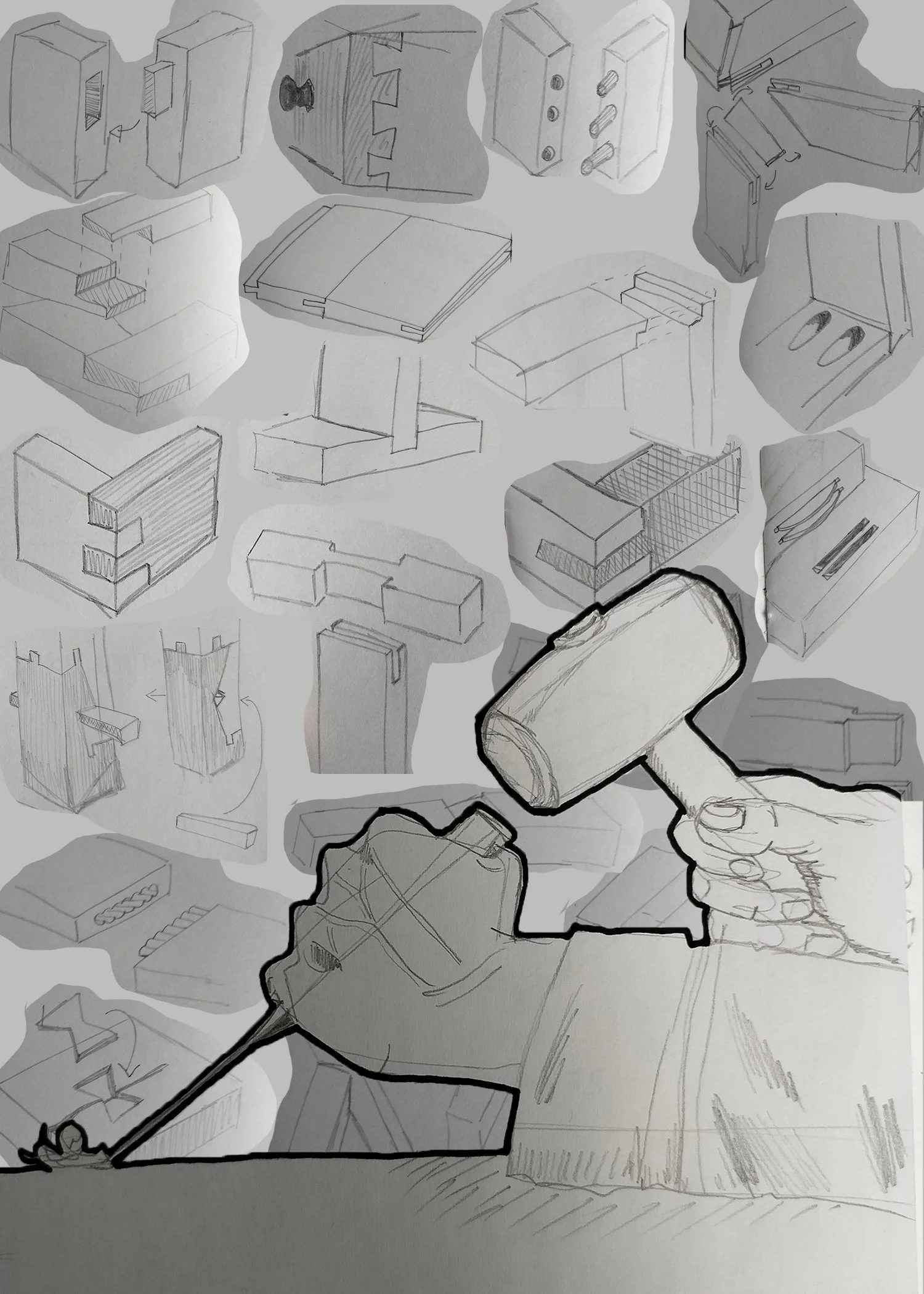
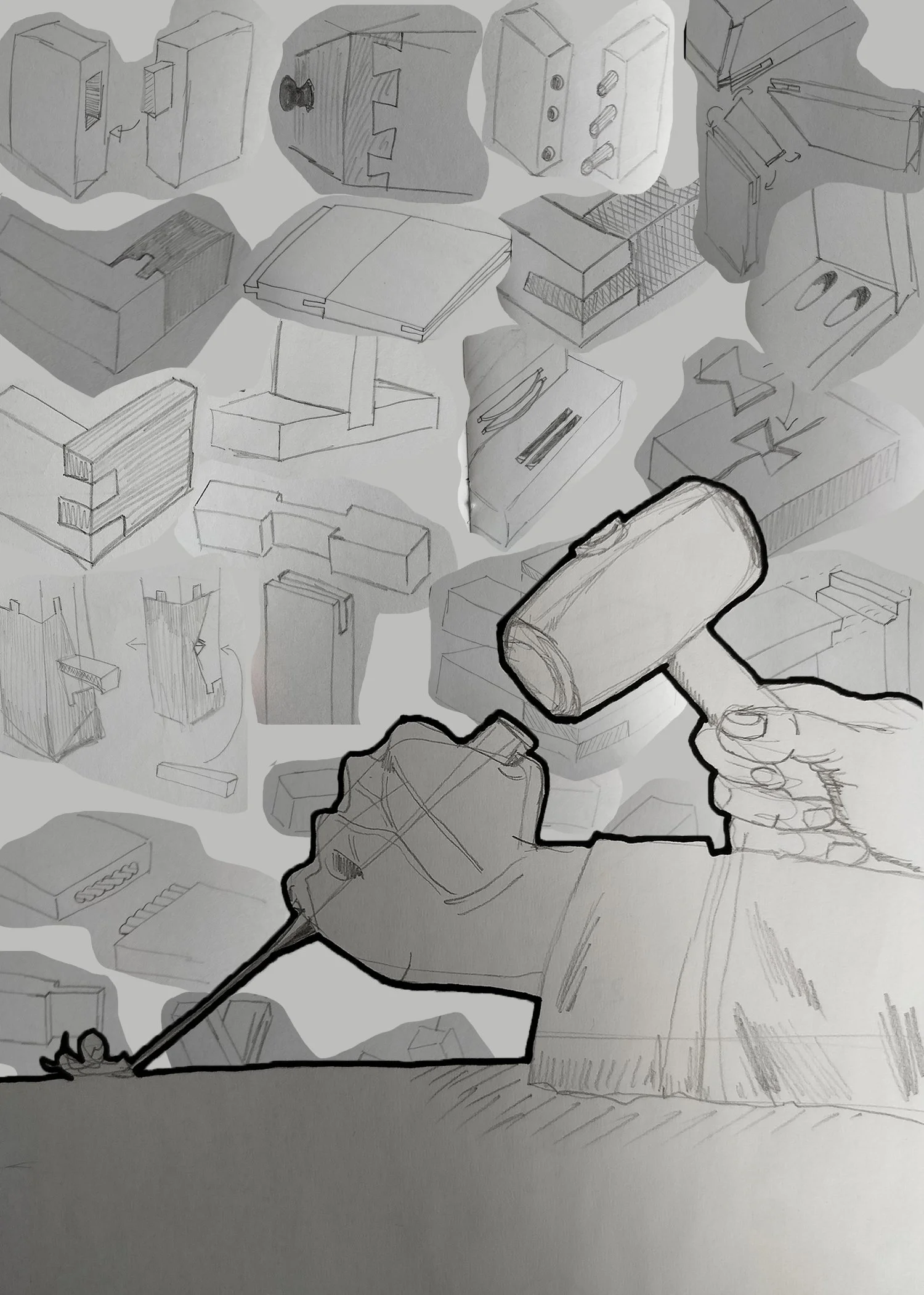

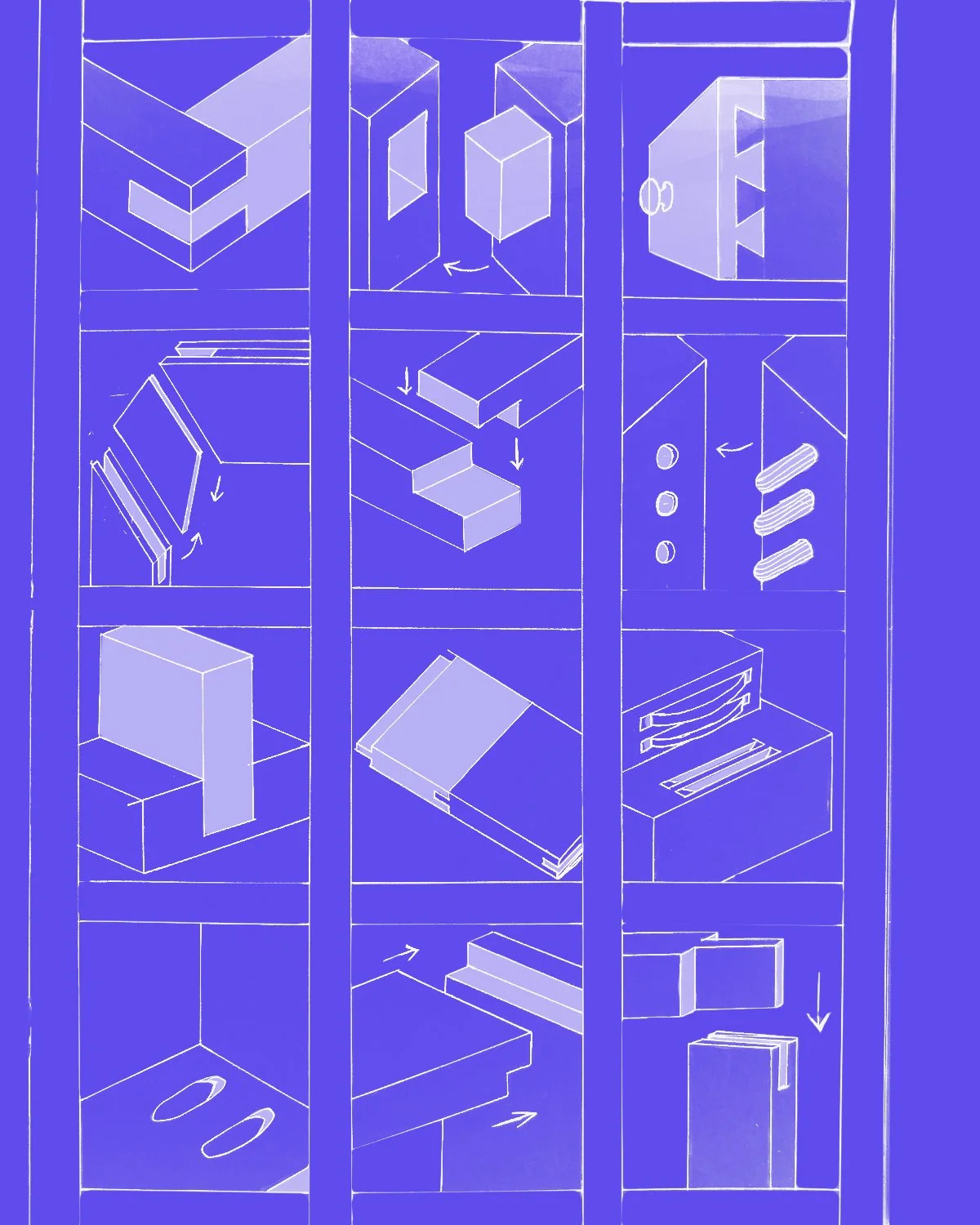
I transferred my sketches into photoshop, played around a bit, and tried to see, roughly, what it would look like. I think I’d like there to be a bit of empty space at the bottom. As I’ll be carving into wood, I’m hoping the natural grain on the wood will come through in that area when I print it. (Might as well try to use its innate design to its fullest!) I also added a grid in the background, like it was drawn on graph paper. I think a bit of structure looks pretty good here; it adds a bit more contrast between foreground and background. (Now that I look at it again, it kinda reminds me of a shoji screen?)
INSPO
I’m using this as a rough reference. I like the line work and the colouring and spacing. I’m also drawn to the use of labelling here, so that’s something to consider with my own work too… (source: pinterest)
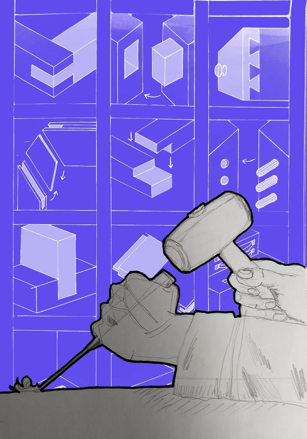
A bit more sketching, a bit more refining, a bit more whacking things into photoshop and now it’s starting to look like a blueprint! I need to start thinking about colours as well. Do I want to make things black and white and grey? Or do I want to make these truly look like blueprints and use a blue colour palette? How many layers would I like to do?
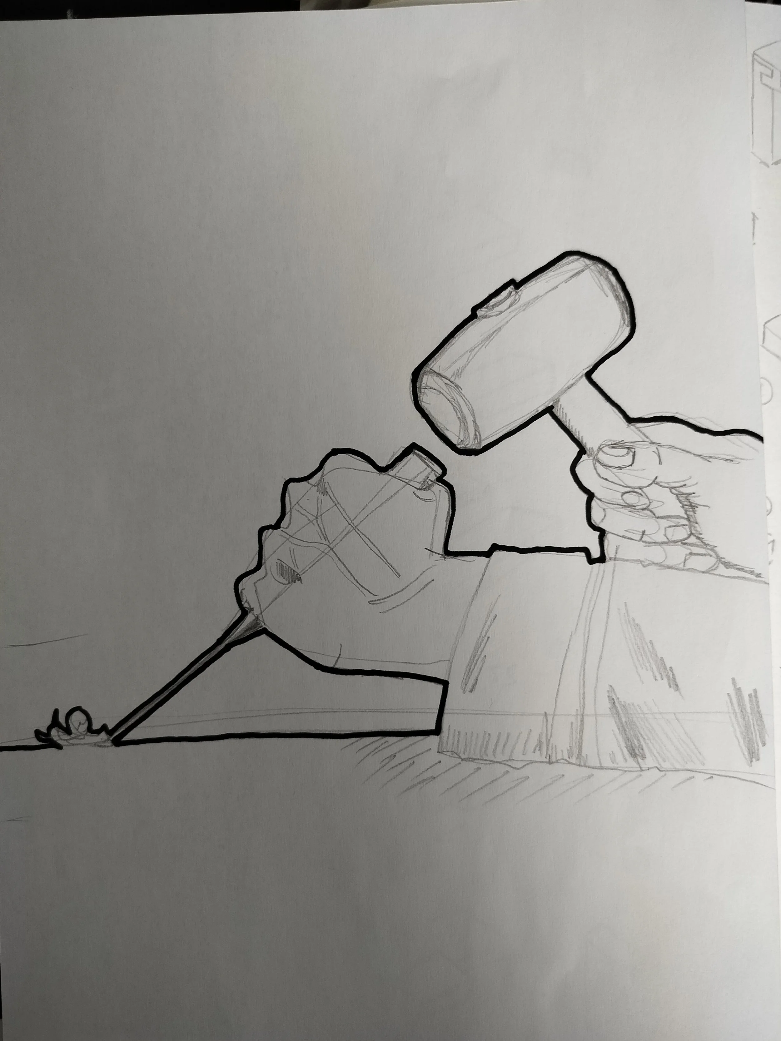
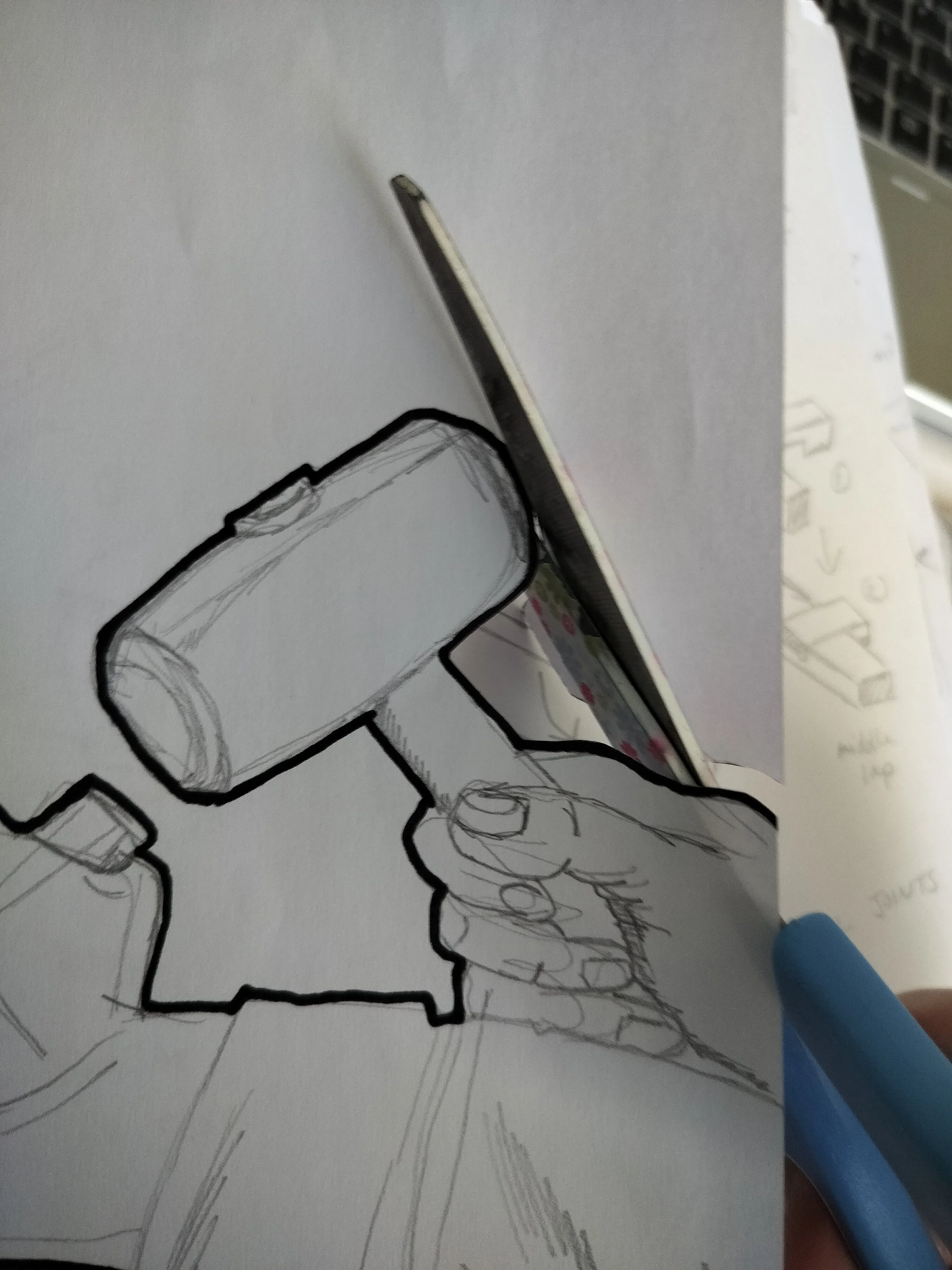
And another question I have: Do I include the hand with the chisel and mallet or just do the grid?
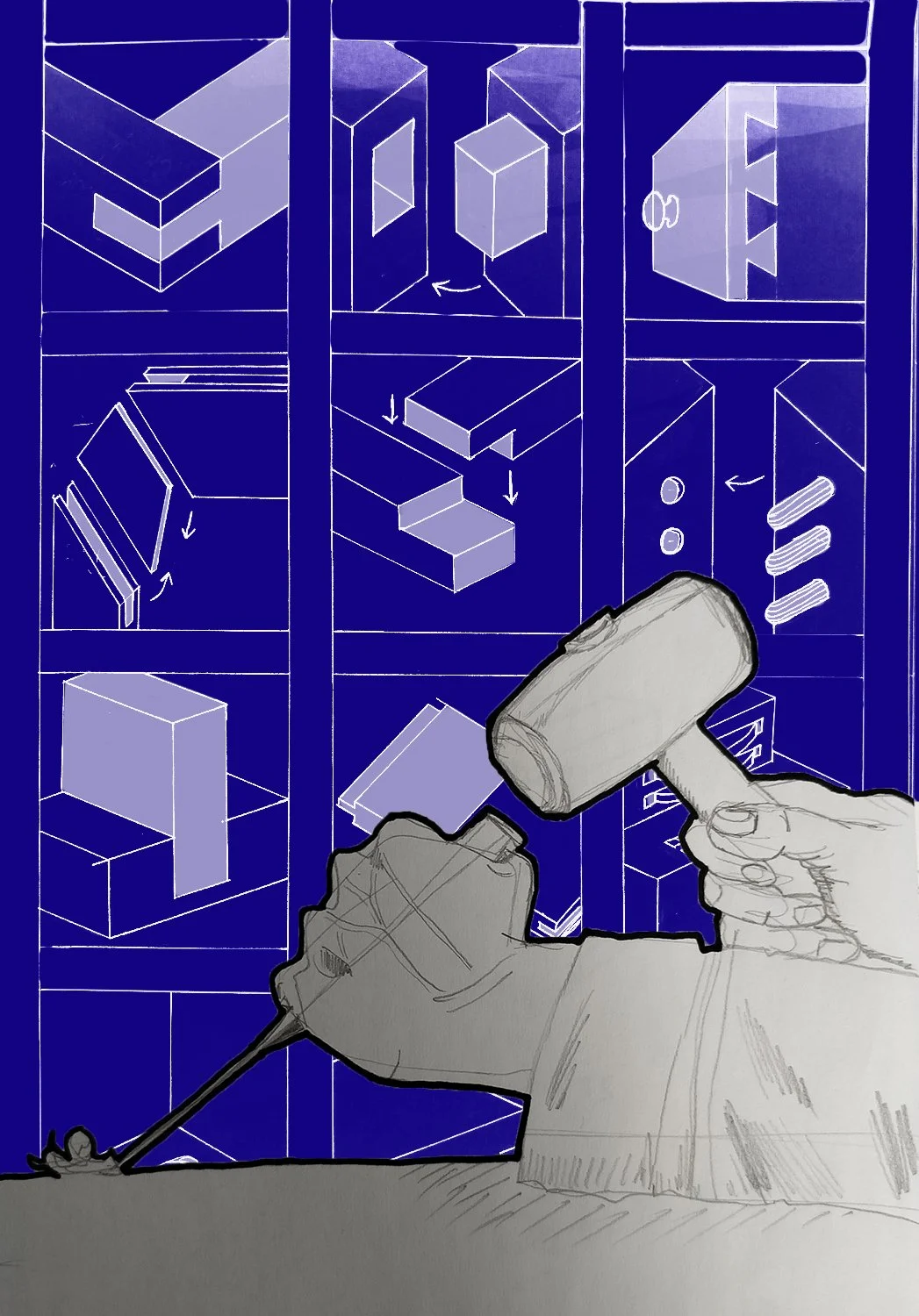
Well, it’s the start of a new month and that was my deadline, so let’s just work with what I’ve got.